R with PowerBI – A step by step guide approach
June 5, 2016 Leave a comment
A lot of interests are visible everywhere how to integrate R scripts with Microsoft PowerBI dashboards. Here goes a step by step guidance on this.
Lets assume, you have some couple of readymade R code available, for example , with ggplot2 library. Lets find the following scripts performing analytics using CHOL data.
-
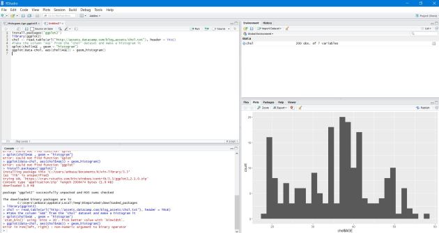
Open R studio or R Package (CRAN) & install ggplot2 library first.
- Paste the following R script & execute it.
install.packages(‘ggplot2’)
library(ggplot2)
chol <- read.table(url(“http://assets.datacamp.com/blog_assets/chol.txt”), header = TRUE)
#Take the column “AGE” from the “chol” dataset and make a histogram it
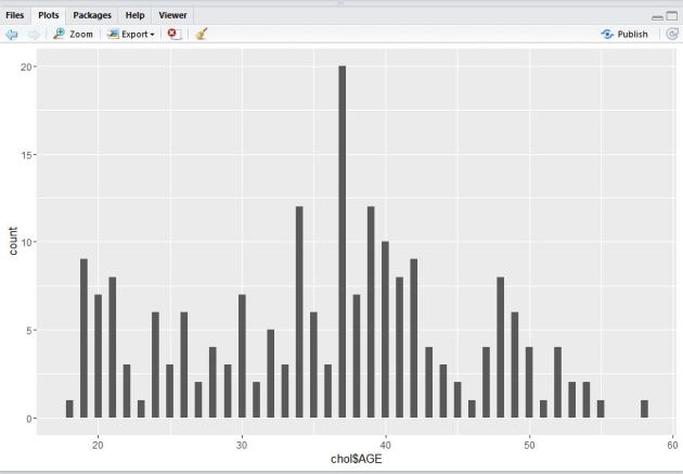
qplot(chol$AGE , geom = “histogram”)
ggplot(data-chol, aes(chol$AGE)) + geom_histogram()
you should be able to see the visuals output like this.
3. Next, execute the following pieces of R code to find out the binwidth argument using ‘qplot()‘ function.
qplot(chol$AGE,
geom = “histogram”,
binwidth = 0.5)
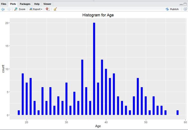
4. Lets take help of hist() function in R.
#Lets take help from hist() function
qplot(chol$AGE,
geom=”histogram”,
binwidth = 0.5,
main = “Histogram for Age”,
xlab = “Age”,
fill=I(“blue”))
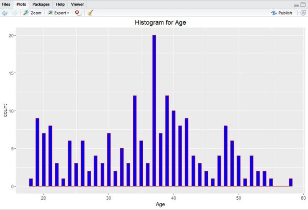
5. Now, add I() function where nested color.
#Add col argument, I() function where nested color.
qplot(chol$AGE,
geom=”histogram”,
binwidth = 0.5,
main = “Histogram for Age”,
xlab = “Age”,
fill=I(“blue”),
col=I(“red”))
6. Next, adjust ggplot2 little by the following code.
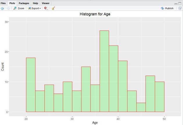
#Adjusting ggplot
ggplot(data=chol, aes(chol$AGE)) +
geom_histogram(breaks=seq(20, 50, by = 2),
col=”red”,
fill=”green”,
alpha = .2) +
labs(title=”Histogram for Age”) +
labs(x=”Age”, y=”Count”) +
xlim(c(18,52)) +
ylim(c(0,30))
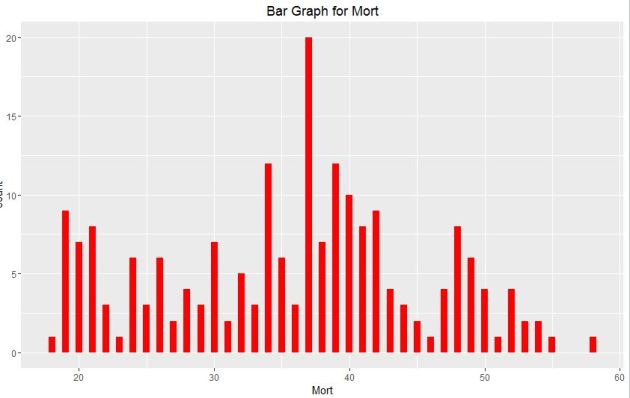
7. Plot a bar graph with this following code.
#Plotting Bar Graph
qplot(chol$AGE,
geom=”bar”,
binwidth = 0.5,
main = “Bar Graph for Mort”,
xlab = “Mort”,
fill=I(“Red”))
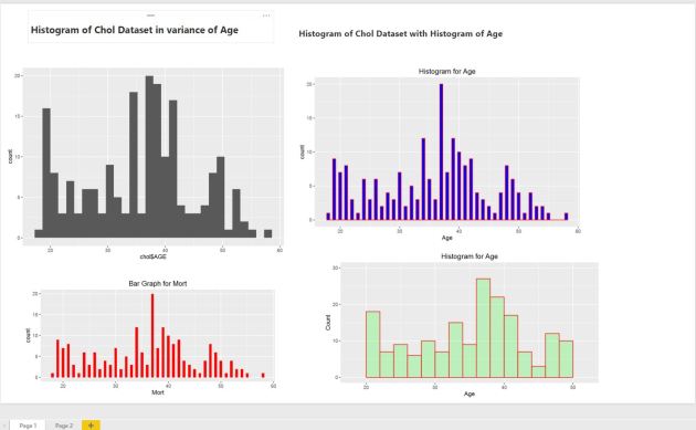
8. Next, open PowerBI desktop tool. You can download it free from this link. Now, click on Get Data tab to start exploring & connect with R dataset. 
If you already have R installed in the same system building PowerBI visuals , you just need to paste the R scripts next in the code pen otherwise , you need to install R in the system where you are using the PowerBI desktop like this.

9. Next, you can also choose the ‘custom R visual’ in PowerBI desktop visualizations & provide the required R scripts to build visuals & finally click ‘Run’.

10. Build all the R function visuals by following the same steps & finally save the dashboard.
11.You can refresh an R script in Power BI Desktop. When you refresh an R script, Power BI Desktop runs the R script again in the Power BI Desktop environment.


You must be logged in to post a comment.