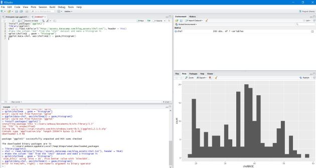
A lot of interests are visible everywhere how to integrate R scripts with Microsoft PowerBI dashboards. Here goes a step by step guidance on this.
Lets assume, you have some couple of readymade R code available, for example , with ggplot2 library. Lets find the following scripts performing analytics using CHOL data.
Open R studio or R Package (CRAN) & install ggplot2 library first.
Paste the following R script & execute it.
install.packages(‘ggplot2’)
library(ggplot2)
chol <- read.table(url(“http://assets.datacamp.com/blog_assets/chol.txt”), header = TRUE)
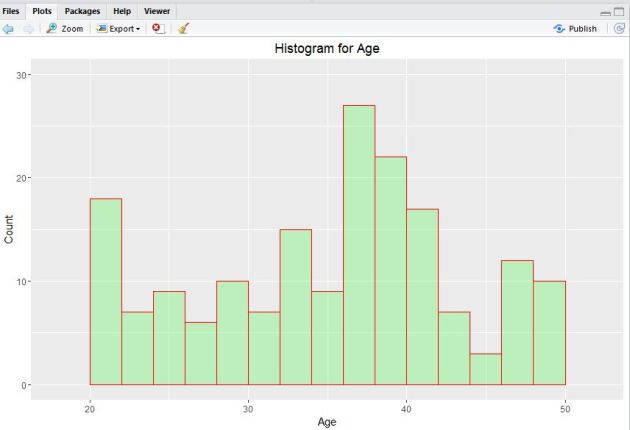
#Take the column “AGE” from the “chol” dataset and make a histogram it
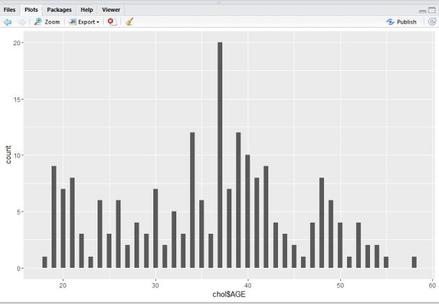
qplot(chol$AGE , geom = “histogram”)
ggplot(data-chol, aes(chol$AGE)) + geom_histogram()
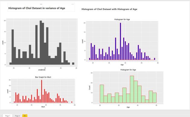
you should be able to see the visuals output like this.
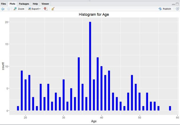
3. Next, execute the following pieces of R code to find out the binwidth argument using ‘qplot()‘ function.
#Lets take help from hist() function
qplot(chol$AGE,
geom=”histogram”,
binwidth = 0.5,
main = “Histogram for Age”,
xlab = “Age”,
fill=I(“blue”))
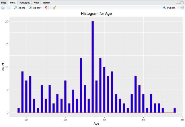
5. Now, add I() function where nested color.
#Add col argument, I() function where nested color.
qplot(chol$AGE,
geom=”histogram”,
binwidth = 0.5,
main = “Histogram for Age”,
xlab = “Age”,
fill=I(“blue”),
col=I(“red”))
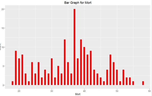
6. Next, adjust ggplot2 little by the following code.
#Plotting Bar Graph
qplot(chol$AGE,
geom=”bar”,
binwidth = 0.5,
main = “Bar Graph for Mort”,
xlab = “Mort”,
fill=I(“Red”))
8. Next, open PowerBI desktop tool. You can download it free from this link. Now, click on Get Data tab to start exploring & connect with R dataset.
If you already have R installed in the same system building PowerBI visuals , you just need to paste the R scripts next in the code pen otherwise , you need to install R in the system where you are using the PowerBI desktop like this.
9. Next, you can also choose the ‘custom R visual’ in PowerBI desktop visualizations & provide the required R scripts to build visuals & finally click ‘Run’.
10. Build all the R function visuals by following the same steps & finally save the dashboard.
11.You can refresh an R script in Power BI Desktop. When you refresh an R script, Power BI Desktop runs the R script again in the Power BI Desktop environment.
The demo provides step by step guidance on quick setup of datazen server on single node server & connecting with publisher app to build custom visuals.
Pre-requisites for the demo :
An active Azure subscription.
Windows 10 store(for installation of Datazen publisher)
5. Select the Windows Server 2012 R2 Datacenter image.
6. Click the next arrow at the bottom right.
7. Enter the required information for Virtual machine configuration.
o Virtual machine name
o Choose Basic or Standard Tier (recommended)
o Choose A4 as the machine size. A4 has 8 cores, which is the minimum number of cores for a single machine setup.
o Enter the machine admin username/password.
o Click the next arrow.
8. Enter the required information for Virtual machine configuration.
o Select option Create a new cloud service.
Make sure the Cloud Service DNS Name is available.
o Choose the subscription it should be billed to, the region it should be deployed.
Choose the one closest to your location
o Leave the Storage Account and Availability Set as is.
o Add an HTTP endpoint at a minimum.
You may need to scroll to add the endpoint.
o Click the next arrow.
9. Select Install VM Agent and leave other unchecked.
10. Click the checkmark to start the deployment process.
You’ll see it start the provisioning process in the list of the virtual machines you are responsible for in Azure.
11. Wait for the status to change from Starting to Running in virtual machines.
12. Select your VM then click Connect.
13. Save the RDP file to your local machine.
14. Open the saved Remote Desktop Connection file, then click Connect.
15. Connect to the VM via Remote Desktop and enter the admin username/password.
16. Click Yes to connect to Server.
17. Click Configure this local server in the Server Manager dashboard that appears when you login.
18. Then change the IE Enhanced Security Configuration to Off for Administrators.
You can always change it back if you really want to when you’re done.
19. Close the Server Manager.
Section 2: Install the Datazen Server
1. Navigate to the following link and download the Datazen server software onto the VM. You may need to turn off IE Enhanced Security on the server to do so.
2. The Datazen server files download as a zipped file. Extract all the files
3. Open Datazen Enterprise Server.3.0.2562.
4. Click run to start the install process.
5. In the Datazen Enterprise Server Setup click Next.
6. Click Next in the Setup wizard, accepting the terms in the License Agreement and moving through each screen.
7. Click Next on the Features page.
8. Click Next on the Core Service Credentials page.
9. Once you get to the Admin Password page, type a Password for the Datazen admin user. (Fig. 20)
This doesn’t have to be the same password as you used for the server.
10. Click Next.
11. On the Authentication page, leave the Authentication Mode as Default.
12. Click Next.
13. On the Repository Encryption page, select Copy to Clipboard, then paste the key into a Notepad file.
14. Save the Notepad file to a safe location.
15. Click Next.
16. On the Instance Id page, select Copy to Clipboard then paste the Id into a Notepad file.
17. Save the Notepad file to a safe location.
18. Click Next.
19. On the Data Acquisition Service Credentials page, leave the credentials as is, then click Next.
20. On the Web Applications IIS Settings page leave the default settings, then click Next.
21. On the Control Panel Email Settings page, leave the default values since this is a test server.
22. Click Next.
23. On the Ready to Install page, click Install and wait until the installation is complete. This might take a few minutes.
Make sure you replace the yourcloudservicename with the name of your cloud service.
3. If you can successfully connect, you should see the Control Panel Log In screen.
4. Enter the username admin and the password you entered in the Setup wizard, then select Log In.
5. You will need to create a new user to start creating dashboard hubs, since you need each hub to have an owner. The owner can NOT be the admin user. Click Create User to create your first user.
6. Enter a value in the top three fields (the email address can be fake if you want) and select Create User.
7. You will now see a new option to Create BI Hub.
8. Enter Hub name whatever you’d like, but make sure you enter the username of the user you just created for owner username.
9. Enter a maximum number of users that can connect to hub.
10. Click Create.
11. Finish the creation of the hub. It will be displayed in the list of available hubs.
12. The new hub will also be shown in the navigation menu at the bottom left of the screen.
13. Click the Server Users link on the left-hand side of the screen.
14. Click Create User.
15. Fill in the fields under Required Info.
16. Click Create User.
17. You will see the user and a Set password link option next to the username.
18. Click on Set password link and then copy the link to your clipboard. Note: This step is only required as the email notification is not set up.
19. Logout as the admin
20. Open a new browser window and paste the URL to reset the password into the address bar.
You can now finish setting up that user by entering the password for the account.
21. In the Control Panel Activate User Account screen, then enter the new password, then re-type password
22. Click Activate My Account. (Fig. 40)
23. Logout as this user and log back in as the admin before proceeding.
Section 4: Apply a Custom Branding
1. To add the Wide World Importers brand package to the server, save it locally. The package is provided with this demo.
2. Click on the Branding link on the left-hand side and upload the brand package to the server.
3. Make sure you choose the Server to upload it to.
You will see the Server icon has the Wide World Importers branding associated.
4. To make sure it was applied properly, open a new browser and navigate to the following URL (make sure you replace the mycloudservicename with whatever you named yours)
Your Server Login screen should look as shown on the right, now having the Wide World Importers brand package applied. (Fig. 43)
Section 5: Connect to the Datazen Server with Publisher
1. Open the Datazen Publisher app
If this is the first time using the app, you will have the option of connecting the Datazen demo server. We recommend doing that, so you will have some nice demo dashboards to show immediately.
2. To add new server Right-click in the dashboard, then click Connected. (Fig. 44)
3. Click Add New Server Connection (Fig. 45)
4. Provide the following information to connect to a Datazen server. (Fig. 46)
Server Address: mycloudservicename.cloudapp.net
User name: user name that created
Password: provide user password
5. Uncheck Use Secure Connection.
6. Click Connect. (Fig. 46)
7. When connected, you should be able to publish dashboards to your Datazen server. (Fig. 47)
8. You will see a nice dashboard with KPIs for Wide World Importers and Fabrikam Insurance. (Fig. 47)
Recently, it has been introduced the integration of ASA & AML available as preview update & it’s possible to add AML web service URL & API key as ‘custom function‘ with ASA input. In this demo, realtime tweets are collected based on keywords like ‘#HappyHolidays2016‘, ‘#MerryChristmas‘, ‘#HappyNewYear2016‘ & those are directly stored on a .csv file saved on OneDrive. Here goes the solution architecture diagram of the POC.
Now, add the Service Bus event hub endpoint as input to the ASA job, while deploy the ‘Twitter Predictive Sentiment Analytics Model‘ & click on ‘Open in Studio‘ to start deploy the model. Don’t forget to run the solution before deploying.
Once the model is deployed, open the ‘Web Service‘ dashboard page to get the model URL & API key, click on default endpoint -> download the excel 2010 or earlier apps. Collect the URL & API key to apply it to ASA function credentials for AML deployment.
Next, create an ASA job & add the event hub credentials where the real world tweets are getting pushed & click on ‘Functions‘ tab of ASA job to add the AML credentials. Provide model name, URL & API key of the model & Once, it’s added, click on Save.
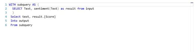
Now, add the following ASA SQL to aggregate the realtime tweets sentiment scores coming out from predictive twitter sentiment model.
Provide the output as Azure Blob storage, add a container name & serialization type as CSV & start the ASA job. Also, start importing data into PowerBI desktop from the ASA output Azure blob storage account.
PowerBI desktop contains in-built power Query to start preparing the ASA output data & processing data types. Choose the AML model sentiment score datatype as decimal type & TweetTexts as Text(String) type.
Start building the ‘Twitter Sentiment Analytics‘ dashboard powered by @AzureStreaming & Azure Machine Learning API with realworld tweet streaming, there’re some cool custom visuals are available on PowerBI. I’ve used some visuals here like ‘wordcloud‘ chart which depicts some of the highly scored positive sentiment contained tweets with most specific keywords like ‘happynewyear2016‘, ‘MerryChristmas‘,’HappyHolidays‘ etc.
While, in the donut chart, the top 10 tweets with most positive sentiment counts are portrayed with the specific sentiment scores coming from AML predictive model experiment integrated with ASA jobs.
The Azure Data Catalog (aka previously PowerBI Data Catalog) has released in public preview on last monday(July 13th) @WPC15, which typically reveals a new world of storing & connecting #Data across on-prem & azure SQL database. Lets hop into a quick jumpstart on it.
Connect through Azure Data Catalog through this url https://www.azuredatacatalog.com/ by making sure you are logging with your official id & a valid Azure subscription. Currently , it’s free for first 50 users & upto 5000 registered data assets & in standard edition, upto 100 users & available upto 1M registered data assets.
Lets start with the signing of the official id into the portal.
Once it’s provisioned, you will be redirected to this page to launch a windows app of Azure Data Catalog.
It would start downloading the app from clickonce deployed server.
After it downloaded & would prompt to select server , at this point it has capacity to select data from SQL Server Analysis service, Reporting Service, on-prem/Azure SQL database & Oracle db.
For this demo, we used on-prem SQL server database to connect to Azure Data Catalog.
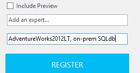
We selected here ‘AdventureWorksLT’ database & pushed total 8 tables like ‘Customer’, ‘Product’, ‘ProductCategory’, ‘ProductDescription’,’ProductModel’, ‘SalesOrderDetail’ etc. Also, you can tags to identify the datasets on data catalog portal.
Next, click on ‘REGISTER’ to register the dataset & optionally, you can include a preview of the data definition as well.
Once the object registration is done, it would allow to view on portal. Click on ‘View Portal’ to check the data catalogs.
Once you click , you would be redirected to data catalog homepage where you can search for your data by object metaname.
in the data catalog object portal, all of the registered metadata & objects would be visible with property tags.
You can also open the registered object datasets in excel to start importing into PowerBI.
Click on ‘Excel’ or ‘Excel(Top 1000)’ to start importing the data into Excel. The resultant data definition would in .odc format.
Once you open it in Excel, it would be prompted to enable custom extension. Click on ‘Enable’.
From Excel, the dataset is imported to latest Microsoft PowerBI Designer Preview app to build up a custom dashboard.
Login into https://app.powerbi.com & click to ‘File’ to get data from .pbix file.
Import the .pbix file on ‘AdventureWorks’ customer details & product analytics to powerbi reports & built up a dashboard.
The PowerBI preview portal dashboard has some updates on tile details filter like extension of custom links.
The PowerBI app for Android is available now, which is useful for quick glance of real-time analytics dashboards specially connected with Stream analytics & updating real time.
As per as the last demo on IoT foundation stuffs, we’ve seen how it’s possible to leverage the real-time data insights from social media datasets like Twitter with some keywords. In this demo, we are trying to pushing realtime sensors data from Windows Phone device to Azure Stream Analytics (through Service Bus EventHub channels) & after processing in ASA hub publishing out to realtime PowerBI dashboard or near real-time analytics(NRT) on PowerView for Excel by pushing out ASA events to Azure SQL database through Excel PowerQuery.
An overview of n-tier architecture of ASA on IoT foundation is like this:
While, IoT always enables customers to connect their own device on Azure cloud platform & bring out some real business value from it, whether it produces #BigData or #SmallData.
Another topic is pretty important is to get insights from Weblogs or telemetry data which can bring out good sentiment, click stream analytics values with machine learning.
Here goes a good high level discussion from IoT team.
Coming back to the demo, so, first implemented a sample app for generating Accelerometer 3D events (X, Y, Z) on Windows Phone & Windows Store devices(Universal app) & pushing the generated events as block blob to Azure Service Bus Event Hub.
//read column names
string[] colFields = csvReader.ReadFields();
foreach (string column in colFields)
{
DataColumn datecolumn = new DataColumn(column);
datecolumn.AllowDBNull = true;
csvData.Columns.Add(datecolumn);
}
while (!csvReader.EndOfData)
{
string[] fieldData = csvReader.ReadFields();
for (int i = 0; i < fieldData.Length; i++)
{
if (fieldData[i] == “”)
{
fieldData[i] = null;
}
}
csvData.Rows.Add(fieldData);
}
}
}
catch (Exception ex)
{
}
return csvData;
}
Now, built out ASA SQL query with specific window interval like in this demo, used ‘SlidingWindow(Second,no of interval)’ which generates computation on event hubs data based on the specific time interval mentioned in window.
Next, start implement the processed output visualization on PowerBI preview portal by selecting ‘Output’ tab of ASA job. Once, you provide all the dataset name of output & start the ASA job, on PowerBI portal, would be able to see the specific dataset is created with a small yellow star icon beside.
Here goes a step by step demonstration with video available on my Youtube channel.
The Azure Stream Analytics(ASA) is one of the major component of Microsoft #IoT foundation which has got ‘PowerBI‘ as its output connector for visualization of realtime data streaming into Event hub to Stream Analytics hub, just one month back as ‘public preview’.
In this demo, we’re going to focus to end to end realtime Tweets analytics collecting through Java code using ‘Twitter4j’ library, then store it into OneDrive storage as .csv file as well as storing it into Azure storage as block blob. Then, sending realtime tweets streamed into Service Bus Event Hubs for processing , so, after creating the stream analytics job make sure that the input connector is properly selected as data stream for ‘event hub’, then process ASA SQL query with specific ‘HoppingWindow(second,3) & ‘SlidingWindow(Minute,10,5) with overlapping/non-overlapping window frame of data streaming.
Finally , select the output connector as PowerBI & authorize with your organisational account. Once, your ASA job starts running, you would be able to see the powerbi dataset which you have selected as powerbi output dataset name, start building the ASA connected PowerBI report & Dashboard.
First, a good amount of real tweets are collected based on the specific keywords like #IoT, #BigData, #Analytics, #Windows10, #Azure, #ASA, #HDI, #PowerBI, #AML, #ADF etc.
Now, the data is sent to event hub for realtime processing & we’ve written the ASA-SQL like this.
CREATE TABLE input(
DateTime nvarchar(MAX),
TwitterUserName nvarchar(MAX),
ProfileLocation nvarchar(MAX),
MorePreciseLocation nvarchar(MAX),
Country nvarchar(MAX),
TweetID nvarchar(MAX))
SELECT input.DateTime, input.TwitterUserName,input.ProfileLocation,
input.MorePreciseLocation,input.Country,count(input.TweetID) as TweetCount
INTO output
FROM input Group By input.DateTime, input.TwitterUserName,input.ProfileLocation,input.MorePreciseLocation,
input.Country, SlidingWindow(second,10)
Next, start build up the PowerBI report on PowerBI preview portal. Once you build the Dashboard with report by pinning the graphs, it would like something like this.
You could be able to visualize the realtime update of data like #total tweet counts on the specific keywords, #total twitterusername tweeted , #total tweetloation etc.
In another demo, we’ve used the PowerBI Designer preview tool by collecting processed tweets coming out from ASA hub to ‘Azure Blob Storage’ & then picking it into ‘PowerBI Designer Preview’.
In latest PBI , we’ve got support of combo stacked chart, which we’ve utilized to depict #average tweetcount of those specific keywords by location & timeframe for few minutes & seconds interval.
Also, you could support for well end PowerQ&A features as well like ‘PowerBI for Office 365’ which has natural language processing (NLP) backed by Azure Machine Learning processing power enabled.
like if I throw a question on these realworld streaming dataset on PowerQ&A
show tweetcount where profilelocation is bayarea & London, Auckland, India, Bangalore,Paris as stacked column chart
After that, save the PBI designer file as .pbix & upload into www.powerbi.com , under get data->Local File section. It has got support for uploading PBI designer file as well as data source connector.
Upon uploading, built out the dashboard which has got facility of schedule refresh on preview portal itself. Right click on your PBI report on portal, select settings to open the schedule refresh page.
Here goes the realtime scheduled refresh dashboard of Twitter IoT Analytics on realtime tweets.
The same PBI dashboards can be visualized from the ‘PowerBI app for Windows Store or iOS’ . Here goes a demonstration.
Last weekend, we all were horrified by the terrible earthquake attack over Nepal, India & greater Asia, it’s continued over toll of millions of death which has several parameters to consider like ‘depth of KM’ of the earthquake, ‘magnitude of quake, severity of deaths, number of people died on quake, number of people died on shaking effect’ etc.
In this current powerbi demo, we’re using World’s dreadful earthquake incidents happened over the millennium 1900.
On , Excel power view dashboard, here depicted some the latest death toll analysis report of Nepal Earthquake 2015.
In latest, powerbi designer preview, represented worldwide country wise earthquake magnitude data analysis sorted by Total death & depth of KM of quake intensity.
Last month, 27th february 2015 , there are some new awesome features connected with Microsoft PowerBI, lets have a quick look at this, first of all , in this release , the powerbi comes out of office 365 & Microsoft Office veils & you can now connect your data not only from Excel workbooks /Azure but also from PowerBI Designer files, Sendgrid, SalesForce CRM, Microsoft SQL Server Analysis Service, Azure Stream Analytics(private preview).
In the first demo, I’ve collected real time data from White House Visitors Records directory using OData feed by Socrata api using this link http://open.whitehouse.gov/OData.svc/p86s-ychb from Excel -> PowerQuery-> OData Feed or Excel-> Data-> OData Feed option.
Next, import data into PowerPivot table & build out the linked tables to put out the powerview dashboard.
Also, you can sign up for PowerBI public preview dashboard here , but make sure that the preview is now available for users in United States only.
The PowerMap tour is compiled along with the latest features introduced as Custom Maps in PowerMap & rich set of effects. The powermap tour on White House Visitors records index analysis is available on Youtube.
Upload the excel PowerView Dashboard workbook on PowerBI public preview portal & you can view the amazing experience including PowerQ&A without the environment of Office 365.
In new powerbi public preview portal , lots of option by which you can import data like SQL Server Analysis Service, Excel workbook, PowerBI Designer files, SendGrid, SalesForce CRM, Microsoft Dynamics, Marketo, GitHub, ZenDesk etc.
The new powerbi designer file is available for free download by this link & some spectacular views have been introduced in the designer preview like Tree charts, Gauge, Combo, Tabular etc.
In the next demo, I extracted real time 9-1-1 call records index data from http://data.seattle.gov/ & analysed 911 call records index over 2 days , possible report locations, types of reports all over US & of course over greater Seattle Area.
There was significant breaking update over last few days regarding Scotland voting referendum 2014, while in social media magnificently came up millions of tweets, likes , shares & overall big sentiment & prediction details about Scotland’s next future declaration. In this demo, we would roll over quite a similar social ramp-up of predictive analysis of Voting results of UK over 2014 & 2009 using Microsoft PowerBI & Office 365.
First, throughout the demo, I used the powerbi components like PowerPivot, PowerQuery, PowerView & PowerMap along with PowerQ&A integrated with office 365. Lets start to consume the dataset from ‘online search‘ feature of PowerQuery. Searched here coined the term as ‘UK parliament elections prediction’ & selected the related OData feed URL.
Using PowerQuery editor, analyse & transform the data for processing & feeding into data-model.
Next, after building the data-model , featuring appropriate keys with datasets, first build -up the sample powerpivot dashboard.
To figure-out powerview reports , simply click on PowerView tab & start build Prediction analysis results of UK electoral decisions over 2014 & 2009.
The predictive analytics of UK electoral decisions on 2014 & 2009 has been depicted with respected with representations data & key value of data differentiation which displays analysis through stacked bar & data representations key over entire electoral regions.
Next, Click on ‘Map’ icon & select ‘Launch Power Map‘ to build up PowerMap of 3D visualization on predicted analysed result set over the regions of United Kingdom.
Create first a new ‘Tour’ & add layer to start move over 3D visualization with realistic dashboard views. For this demo, I used ‘electoral regions’ as ‘country‘ field to locate the geography on map.
I created a video presentation of the powermap 3D visualization tour of predictive analytics results of UK over 2014 & 2009.
Next, Check on PowerBI on office 365, you need to have either E3 /E4 subscription of Office 365 tenant or otherwise go for a trial account provisioning from here.
After provisioning PowerBI for Office 365, you need to add permissions for SharePoint users. Add ‘PowerBI for Office 365’ tenant under your subscription & move to ‘sites‘ category & click on ‘team site‘ app.
Next, inside ‘team site’ portal , you will be able to see the option ‘site content‘ , clicking on it jump to ‘PowerBI‘ section for the office 365 site.
Next, after entering into PowerBI tab , add/drag your excel 2013 workbook containing PowerView , PowerMap dashboards into Office 365 portal.
Now, add some natural language enhanced Power Q & A on your analytics dashboard , click on option ‘Add to PowerQ&A‘ & start frame up relative questions to build up real time analytics dashboard on office 365.
For example, in this demo, I utilized the sample queryset as ‘show representations on 2014 by representation in 2009‘ on powerQ&A query bar.
‘Show Representations by Electoral Regions on 2014’ used as a search term & portrayed the predicted result as like this.
Also, visualizing the PowerBI site on o365 is overwhelming in terms of real time analysis all over the dataset & collaborating with the team.
Lastly, to access the real time predictive analytics report on PowerBI is accessible through PowerBI app on Windows Store which leverages to share , collaborate your analytics results on any device & enables to view it anywhere , anytime .
In order to work on Big Data Analytics (ClickStream,Sentiment,RealTime) , its very important to work with PowerBI (PowerQuery & PowerMap) using Office 365. Microsoft Power Query Preview is an Excel add-in that enhances the self-service Business Intelligence experience in Excel by simplifying data discovery and access. Power Query enables users to easily discover, combine, and refine data for better analysis in Excel.
Power Map Preview for Excel 2013 allows you to plot geographic and temporal data visually, analyze that data in 3D, and create interactive tours to share with others.
Download PowerQuery addin for Excel 2013 from here & PowerMap addins for Excel 2013 from here.
Let me show you a brief overview about Power Query after installing the addins for excel. open the PowerQuery tab & check the data importing options.
Under Data sources option on PowerQuery , you will find options to import data from HDFS, Azure HDInsight , even from Facebook too.
For this demo, I have selected , HDFS (Hadoop distributed File System) & Azure HDInsight option.
Lets first create a HDInsight cluster in portal.
Next , provide final configuration values(Azure Storage Account Vaults [ASV] details) in order to create the cluster.
Lets integrate the HDInsight cluster data with PowerQuery of Excel. Choose ‘Data Sources‘ as ‘Azure HDInsight Cluster‘.
On Query Editor, specify the hdfs table data by selecting appropriate query & click on ‘done‘.
Next, click on PowerView in order to create an interactive dashboard with PowerView using PowerQuery from HDFS data of Azure Storage Vault(ASV).
To work with PowerMap for Office 365: after installing the powermap addin , lets choose the ‘Map‘ option from ‘insert’ tab of excel 2013.
Created a sample report using World Bank’s data on Income Basis from Windows Azure Marketplace which has been imported into hdfs.
Created a video tour of the PowerMap dashboard using World Bank’s statistical data of countries by income level. Access it here.


You must be logged in to post a comment.